reiinakano/scikit-plot
ROC curves without the matplotlib boilerplate purgatory
A thin wrapper that turns scikit-learn metrics into presentable plots in one line, because life's too short for manual figure tuning.
Not currently ranked — collecting fresh signals.
star history
What it does
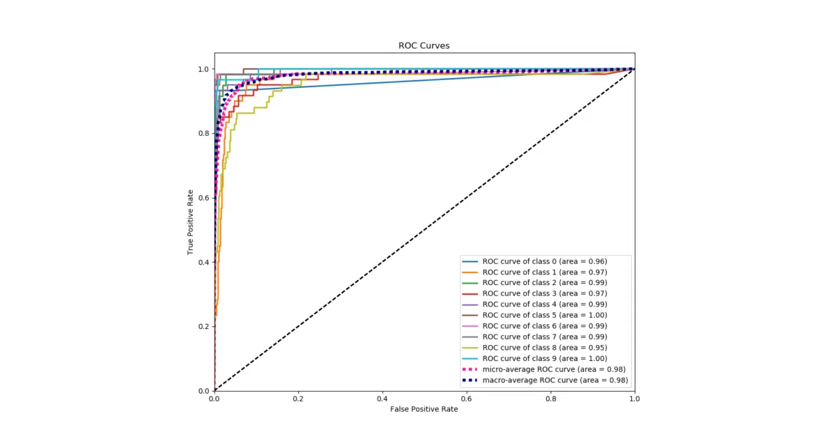
Scikit-plot is a helper library that wraps matplotlib to generate standard machine-learning visualizations—ROC curves, confusion matrices, precision-recall curves, etc.—from scikit-learn estimators or plain numpy arrays. The pitch is simple: one function call instead of twenty lines of matplotlib incantations.
The interesting bit
The library deliberately stays agnostic about your model. It doesn’t care if you trained with scikit-learn, Keras, or “that groundbreaking classifier algorithm you just wrote”; feed it ground-truth labels and predicted probabilities and it will plot. This is glue code, but it’s glue code that knows exactly which corners to cut.
Key highlights
- Single-line functions (
skplt.metrics.plot_roc,skplt.metrics.plot_confusion_matrix, etc.) - Works with any classifier that produces probability arrays, not just scikit-learn objects
- Customization parameters available when you need to tweak colors, labels, or averaging strategies
- Installable via pip or conda-forge; depends only on scikit-learn and matplotlib
- Includes a DOI for citation, if your reviewers demand visual polish
Caveats
- The README’s Keras example uses
nb_epochandpredict_proba, which are dated API signatures; this suggests the examples may not be actively maintained - Travis CI badge and the 0.3.7 version citation imply the project may be in maintenance mode
Verdict
Grab it if you’re tired of writing the same matplotlib boilerplate for every model evaluation. Skip it if you need interactive web-based visualizations or highly bespoke chart designs; this is strictly static matplotlib output for the impatient.
Frequently asked
- What is reiinakano/scikit-plot?
- A thin wrapper that turns scikit-learn metrics into presentable plots in one line, because life's too short for manual figure tuning.
- Is scikit-plot open source?
- Yes — reiinakano/scikit-plot is open source, released under the MIT license.
- What language is scikit-plot written in?
- reiinakano/scikit-plot is primarily written in Python.
- How popular is scikit-plot?
- reiinakano/scikit-plot has 2.4k stars on GitHub.
- Where can I find scikit-plot?
- reiinakano/scikit-plot is on GitHub at https://github.com/reiinakano/scikit-plot.